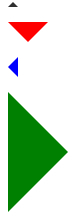
本文用动画的形式一步一步给你呈现CSS实心三角形是怎样制作出来的。
HTML
你可以用一个 div 来制作它们,为每个方向使用一个类。
<div class="arrow-up"></div>
<div class="arrow-down"></div>
<div class="arrow-left"></div>
<div class="arrow-right"></div>
CSS
这个想法是一个宽度和高度为零的盒子,箭头的实际宽度和高度由边框的宽度决定。例如,在向上箭头中,底部边框是彩色的,而左侧和右侧是透明的,这形成了三角形。
.arrow-up {
  width: 0;
  height: 0;
  border-left: 5px solid transparent;
  border-right: 5px solid transparent;

  border-bottom: 5px solid black;
}

.arrow-down {
  width: 0;
  height: 0;
  border-left: 20px solid transparent;
  border-right: 20px solid transparent;

  border-top: 20px solid #f00;
}

.arrow-right {
  width: 0;
  height: 0;
  border-top: 60px solid transparent;
  border-bottom: 60px solid transparent;

  border-left: 60px solid green;
}

.arrow-left {
  width: 0;
  height: 0;
  border-top: 10px solid transparent;
  border-bottom: 10px solid transparent;

  border-right:10px solid blue;
}
execcodegetcode
对于等边三角形,值得指出的是,高度是宽度的 86.6%,所以 (左边宽 + 右边宽) * 0.866% = 底边宽。
相关文章推荐
- 512个CSS图标形状(icon shape)【收藏】
声明:本站所有文章,如无特殊说明或标注,均为本站原创发布。任何个人或组织,在未征得本站同意时,禁止复制、盗用、采集、发布本站内容到任何网站、书籍等各类媒体平台。如若本站内容侵犯了原著者的合法权益,可联系我们进行处理。